Starting my research into film magazine covers, I first looked at the codes and conventions for any magazine cover.
Below is an example of a magazine front cover for the British GQ magazine.
There’s the
Masthead, which is the block title for the magazine which aims to be bold and eye catching for readers, as well as being recognised by people who have brought or read the magazine before because it usually involves a recognisable typography.
Box Out’s are a bold colour behind text to make the text stand out and noticeable.
The main statement of the feature is shown through the
Headline, which is larger than the rest of the text so it’s the first seen. The headline is usually followed by a
Strapline which is the subheading below the main heading describing the article a little more.
Tags are used on the magazine cover within the headlines or straplines which engage readers to take an interest. They used words that entice readers such as ‘sensational’ or ‘new’, which grab the reader’s attention to the story.
The
Main Image of the magazine cover is the main medium to grab audience’s attention because they don’t need to read any words. This is the image that features as one of the main features for the magazine and it usually takes up most of the magazine cover.
Even though the main image and headline show the main focus feature for the magazine,
Cover Lines and smaller
Headlines are on the sides or the bottom of the magazine cover, to reveal the other stories featured in the magazine.
Similar to cover lines and headlines are the
Top and Bottom Strip which can give further information about other articles featured in the magazine.
The
Barcode/Date/Issue numbers and
Price are used to give details about the magazine. The Barcode is so shops can scan it, the date is so readers know if it is new or an old magazine, the issue number is for buyers who may collect the magazine or need to get a specific issue for a reason and the Price is simply so the buyer knows how much the magazine is.
In most magazines,
Pug’s are used in the top right and left hand corners as either a freebie (free toy for children magazine or free poster etc…). Either a logo or promotion can come under a Pug. This is another feature to catch reader’s eye.
Keylights are used to highlight a specific selling point of a magazine, whether it’s the star or an article.
When looking into film magazine covers, I found that there is a significant difference in the type of film magazines that exist and what they usually feature on their cover.
For example this film magazine Empire (UK 2011), features the character of the film on the front, whereas the magazine cover below of Sight & Sound (UK 2011) features the film director Pedro Almodovar as himself, having his makeup done for a photo shoot.
These are two very different types of covers for the film magazine, but they are two completely different film magazines.
Empire is known as the UK’s leading film magazine, so they cover everything from the blockbusters to small independent films but mainly focus on the big releases.
Sight & Sound magazine is run by the BFI (British Film Institute) and they focus on more critically successful, independent and award/festival type films. Almodovar who is seen on the cover of the magazine is a famous, foreign film director who is known for his diverse range of films.
Codes and conventions applied to real magazines
Out of character magazines
This magazine cover features a film director as a drawn picture, which represents his type of film. This is quite unconventional of a film magazine, as they usually feature real photos.
There is a small section on the cover which features a Menu of Headlines, in a blue font so they are easy to see, followed by a small, inviting, description of the article the headline is about.
The magazine’s barcode, date and issue number is featured in the corner.
The Masthead of the magazine is bold and is followed by the magazine’s own headline. On the most part, the title is not covered up by the featured image, but in the bottom right hand corner the hat of the drawn character covers a few letters of the headline.
The main feature for the magazine which links to the featured image, is in a big, bold, capital letter
headline which draws attention to it. The text for the headline is larger than all other fonts on the magazine cover, meaning that it is the first thing audiences will read. Above the director’s name is a small ‘Interview’ text box, describing what the main article is. Underneath the main headline, there is a small sub heading which features the director’s film and a description to audiences.
This magazine is a little different and is actually a Men’s Health and Style magazine instead of a film magazine; however the featured story and image is an actor to promote one of his films.
The other main stories of the magazine are listed on the left hand side, in bold letters and font colours so that they can be easily read as part of a
Headline Menu. Different styles such as bold for titles, red for main title and un-styled for description, are used so that audiences recognise the headline, description and level of importance for each story.
The main feature is in the biggest size font of the cover and in bold
Headline, so that audiences link the image to the story on the front.
The magazine
Masthead is in the top right hand corner, like all of their magazines. This time, the featured image is placed on top of the title even though it is still identifiable by audiences.
Other extra
headlines are seen on the other side of the cover, again in styled font for easier reading.
In Character magazines
The
Masthead for the magazine is in a bright colour because the rest of the magazine colour scheme is quite dark; this is so it is clear and vibrant for readers to notice.
A
Menu Header of other articles featured in the magazine is on the left hand side of the magazine. With different styles so they are noticed.
The main
Headline for the featured image is in big, bold and capital font so that it is noticed straight away. This font is bigger than the other text on the page so that it is noticed and linked with the featured image/
The magazine has its own, special,
headline for this issue which is featured at the top of the page so that it’s important emphasised to passer by’s or readers.
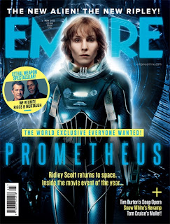
The
Masthead for this magazine is in bold, big letters which takes up the whole width of the magazine. The featured image is in the foreground so it covers some of the Masthead; however the magazine is very well known and can still be noticed.
The
main Header for the magazine is in the middle, across the whole width of the magazine cover. It has different levels of a small introductory ‘The World Exclusive…’ in a Box Out because of the background colour of yellow. The actual attention grabbing Headline is just over the image but is in a font that resembles the film. The
Headline is followed by a small
Tag, especially in the sense of ‘movie event of the year’ as these buzz words entice readers.
The
Barcode is featured on the left hand side of the magazine cover.
A few
Menu Headers are in the bottom right hand corner, with different colours and under a + sign, drawing attention to it. However the text isn’t in a large font in case readers connect it with the featured image.
This
tag like header is at the very top of the page, referring to the main image. It acts as a tag because it is in small words with exclamation points providing short, intriguing statements.
As another form of a Menu Headline, a small image is shown of another feature in the magazine. Because this feature is in a small circle, it is easily not identified as part of the main image and feature.


No comments:
Post a Comment